You may have noticed that the blog posts here have been few and far between lately. That's because I'm now blogging for Channel Frederator. If you don't know what that is, and you are a fan of animation, you should.
One of the coolest things about blogging for them is the weekly interviews. Recently I got to interview one of my childhood animation idols, Will Vinton. There's a 27 minute interview with him if you follow that link. It's an easy to listen to MP3 file.
Anyway, keep checking out Channel Frederator for the latest in animation, and keep checking this blog for our Bishop Animation posts. I'm going to try and keep posting here once a day as well... wish me luck!
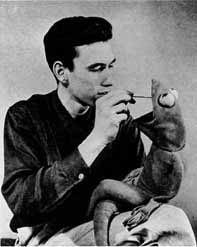
Jim Henson had a great sense of design. I've been doing some research for a project and was impressed with the range of emotions and character traits his characters posess. While much of this comes from how well the characters are performed by their Muppeteers, the design of the characters has a lot to do with it as well.
While everyone knows the Muppets and what they look like, I'd like to look at an animated segment from Sesame Street:
It's a short piece, so you need to establish your characters pretty quickly. Based on appearance alone, you can tell that the king is a kind fellow. He loves his daughters so much that he'd be happy to tell you all about them in song. He probably carries around a bunch of photos of them as well.
The daughters are hard to see in this clip, but on the close-up you can see that this daughter is beautiful yet humble. The eyes and posing of the head are especially nice.
The knights have a nice design to them. Their bodies make it seem as though they are mainly ceremonial in their duties. I doubt they slay dragons or fight in battles.
My favorite character in the piece is the Messenger that shows up at the end. His eyes show his excitement, and his mouth opens wide to help him deliver the great news.
While one could argue that the song and voice work are the strong suit of this piece, for me the character design choices are what make it memorable. The simple shapes and minimal facial details help sell the characters in a fast yet convincing way. This is one of my favorite bits from Sesame Street. Jim Henson and his creative team have a great way of using design elements to help sell a character by looks alone, before the first MEEP, Wakka-wakka, or Yep yep yep.
I saw "Open Season" tonight. The animation was nice, but the stand out for me was the FX. Fur and fluids never looked better. Unfortunately, the story and character development was rather weak.
I didn't really care about the characters. The wild animal with an urban sound has been done to death, and this film has it in spades. There are also snippets of backstory that we learn about some of the characters, but it's explained to us rather than shown to us... which isn't very interesting.
This film also suffers from the same thing that plagues many recent CG films (including Pixar films) - WAY too many characters. I understand that there are many animals in the forest, but there is no reason to show each different kind of animal or give them all business in the film. This is time that could have been spent building up the main characters and making their bond seem more realistic rather than forced.
Animation = A Effects = A+ Character design = B Story = C-
We were recently asked to be part of a collaborative film called "FredEx". We had to come up with ten seconds of animation that featured a robot. Each creative crew was given a topic, and ours was "farts".
Credits: Character design: J Chad Erekson Modelling: Kevin Wisdom UVs: Mike Kopa Textures: Veronica Harper, Kevin Wisdom Rigging: James Jones Jr Animation: Kevin Wisdom Lighting: Kevin Wisdom Effects: Floyd Bishop, Kevin Wisdom Audio: J Chad Erekson Final comp: J Chad Erekson, Kevin Wisdom
So here is what the Fartbot's textures are looking like. Cast iron stomach, rickety joints, and a red hot belly. Textures by Veronica Harper and Kevin Wisdom. Mike Kopa laid out the UVs.
We were asked to be part of a collaborative project featuring robots. Our segment features a robot that farts. Based on that brief description, this is what we came up with.
Midway recently put several of their arcade classics online for people to play. Some of these games were released before some of the people who work at Bishop Animation. Take a trip back to the olden days of videogames to see what gameplay and replay value are all about.
There's a lot of talk about the Nine Old Men. I started to blog about them a few posts back. While researching the Nine Old Men, I started to learn more and more about the animators that aren't part of the list.
Bill Tytla is responsible for a lot of great character animation, but perhaps his best work is on Stromboli. Have a look at this sequence from "Pinocchio", and try to count the emotions Stromboli displays. In my opinion, Stromboli's animation outshines Pinocchio's in this sequence, as the burden of acting is on Stromboli. Without such a grand performance, there is nothing for Pinocchio to react to. Take a look and see for yourself:
Even though Bill Tytla was paid well as an animator, he was a part of the Disney strike in 1941. The strike was a dark time for the Disney studios, and many of the artists who did strike were pressured out of the studio in one way or another. Bill Tytla was no different.
Tytla's perception was that he was unwelcome at the Disney studio. Less challenging work, his wife's three-year long illness with tuberculosis, fear of Japanese attack, and a desire to live on his Connecticut farm eventually led him to the decision to leave the studio. He resigned from the Disney studio on February 24, 1943, an action he regretted for the remaining twenty-five years of his life. (source: The Vladimir Tytla Page)
You can bet dollars to doughnuts that this is why Bill Tytla is not on the list of Walt's Nine Old Men, even though he obviously had the talents to be included on such a list.
My kids loved watching all his various shows and specials. We enjoyed watching each week as Steve showed us things about animals that we had never seen or known before. Hopefully his family is well taken care of, and continues to bring attention to animal conservation and education.
Les Clark is one of the lesser known of the Nine Old Men. Les was once an ice cream server, which was where he met Walt. Shortly after that meeting, when Les was graduating from high school, he asked Walt for a job. Walt had him bring in some drawings, and then hired him for a short stint at the studio. The temp job turned into a career.
The cartoon shown above is from 1927, the year Les started at the studio. He went on to create many memorable performances, including Mickey Mouse in "The Sorcerer's Apprentice" from "Fantasia", and the show opening featuring Tinkerbell from the classic Disneyland TV series.
I plan on doing a post on each of the Nine Old Men over the next few weeks. Keep watching this space.
Here is a sneek peek at our work on the animated opening for Nickelodeon/Frederator's "Random Cartoons" cartoon show. The logo itself is made up of ping pong balls aranged in a random pattern. The device pictured above is how the ping pong balls get hurled around the room.
You can see a WIP animation of the contraption here:
The American Broadcasting Company first aired Saturday morning television shows for children on August 19, 1950. The network introduced two shows: Animal Clinic featured live animals, while the variety show Acrobat Ranch had a circus theme. Placed against a Western backdrop, acrobats Tumbling Tim and Flying Flo lent an air of spectacle to Acrobat Ranch. In one segment, Host Uncle Jim presided over a game in which children from the studio audience competed for merchandise prizes.
Whew! We're back from Siggraph, and what a week it was! There was so much to see, and so many new pieces of software to check out. While Maya 8 was impressive, and the Davey Jones presentation was very cool, I think the best bit of animation I saw at the show was from the upcoming Sony movie "Open Season".
I saw a presentation at the Houdini booth, showing how Houdini was used for a water sequence. Although it was high technology, it looked like a bear and a deer going down a river on a log. The technology served the story, and not the other way around. Very nice. I'm looking forward to this film now more than any other upcoming film.
Speaking of CG, check out the new Disney logo:
I like it alot. It reminds me of the old Disney shows hosted by Walt Disney. If the presentations on "Meet the Robinsons" are any indication, the future of Disney Animation is very bright.
We're headed up to Boston for Siggraph. It should be a good time. If you're up there, stop by the http://www.colonnadehotel.com/ and say hello. If you're looking for work, drop off your reel at the front desk.
If you aren't going to Siggraph, or would rather not carry around reels, go ahead and mail us your work:
Bishop Animation ATTN: desired position (ex: "attn: rigging") 214 Ninth Street Honesdale, PA 18431