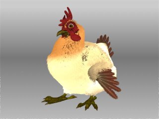
 In this first render, the fur isn't taking any attributes from the lights.
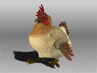
 OK. This one is a little better, but the fur is still too hot. It's still not getting the right info from the lighting. Also, check out that ugly shadow under the chicken. Gross!
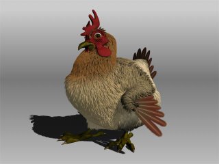
 The fur is looking a bit better, but the shadow is still Yuck City.
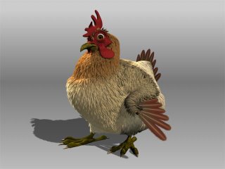
 OK. We're almost there. The fur is taking on the attributes we want from the light. There's only one light in this scene.
Using what we learned from this test, we'll know how to light the chicken correctly.
Here's a look at where we are at now with the chicken.
Here's a look at where we are at now with the chicken.

0 comments:
Post a Comment